Actually.. you want OPINIONS...
... and it makes me wonder why you would care what I might like or what the MAJORITY might like. Whatever YOU choose... I'll still be your friend!
Some folks will actually tell you which cap is RIGHT and which cap is WRONG. Therein again... unless you are into CAMOFLAGE... and trying to blend into your surroundings, I would say color would not really matter.
(Maybe I hit on the a possiblity here... choosing what the MAJORITY likes kinda brings you into the group, or blends you into the surroundings! AH HA! Boy... am I good!)
Welp... ir-regardless... here is what I THINK the colors and caps do...
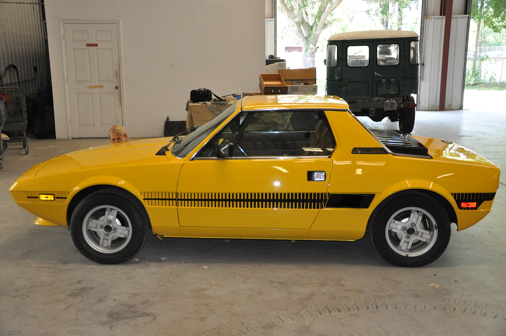
1. NONE... A purist would say they are all incorrect for the car, even if it is a BERTONE... as it is now depicted to be an early FIAT. Sell the wheels and buy the proper steel ones with the black FIAT center caps.
2. NONE... A purist RACER would say they only add weight, inhibit air flow, add nothing to forward speed or handling. Leave them off.
3. THE COLOR BLACK... is kinda subdued and does not catch the eye for either the Scorpian or B logos... Good if you are kinda timid... so repaint the car Medium Metallic Blue and loose the side stripes.
4. THE COLOR RED... especially with the Scorpian Logo (ABARTH) says RACER and really draws your attention to the wheels. Red is danger, speed and all those GOOD things associated with racing. Mike Sotor did this with his racer, and at one time Ricardo Borja had Red caps on his yellow car also. Really pops and works for all I've indicated above.
5. THE COLOR YELLOW... and the mild mannered Bertone wording kinda matches and goes nicely with the cars body color... and says CRUISER or GT car. Again... loose the stripes... The BLUE in the logo would go well with a repaint to Medium Mettallic Blue body color and then the yellow would pop.
IN CONCLUSION... If it were MY car and I wanted to carry on the CURRENT RACY THEME you've created with the YELLOW body color the BLACK RACY STRIPES, and the BUMPERLESS treatment... A nice touch of RED in the center caps would really pop and also be APPROPRIATE.
In a word, RIGHT for the car.
Just MY opinion... and what I base it on...
But PLEASE... do what YOU want... and I'll support your decision regardless of YOUR reasoning.
Now... wanna add a rear wing? We can start this conversation all over again!
HA!


")


